COPY OF THE EXPO-DESCRIPTION-TEXT (APRIL 2023)
////////////////////////////////////////////////////////////////////////////////////////////////////////////////////////////


////////////////////////////////////////////////////////////////////////////////////////////////////////////////////////////
DEAR VISITOR!
Welcome to the Laureate-exhibition of the Internationale Grote Prijs Kalligrafie of Westerlo 2022. For your orientation, I’d like to shed some light on the presented works here in the foyer and the corridor.
Apart from the first work directly left from the entrance („one view on nine circles“), all the other works are part of an ongoing, long term artistic research, started around 2019. My overall aim is to explore the intriguing interconnection of geometric structures & calligraphy. Both are deeply connected in manifold ways and many cultures around the world have their own acquaintance with this interconnection. Reflections about historic writing styles and traditional art forms such as Islamic geometric art merge with my passion for the mathematical principles behind and the visual potentials of mesmerizing visual rhythms.
Before getting specific, let me offer to you an overall metaphor for what you’re looking at: These works are like maps of a distinct infinity. They are mathematical relations turned into visual landscapes. These landscapes are abstract, but they capture something lively in a way. Something that enables growth, harmonically organized by its own rules. Rather than using calligraphy to interpret authors, I use it to enhance the power behind the geometric shapes: number & proportion.
I often get asked if I depict animals and mythical creatures on purpose. Yes and no. Like the children's game of seeing pictures in clouds, creature-likenesses appear via a phenomenon called pareidolia - our natural inclination as human beings, to see signs of life in abstract pattern. By shaping silhouettes and contrasts, I indirectly imply certain morphologies & postures.
But now to the series in specific.
WAARDE BEZOEKERS,
welkom bij de Laureaten-tentoonstelling van de Internationale Grote Prijs Kalligrafie van Westerlo 2022. Om u een oriëntatie aan de hand te geven wil ik proberen een beetje licht in het donker van de tentoongestelde werken hier in het foyer en in de gang te brengen.
Behalve het eerste werk direct aan de linkerkant van de ingang („Één zicht op negen kringen“) zijn alle andere werken onderdeel van een voortdurend, langlopend onderzoek, begonnen rond 2019. Mijn gehele streven is de ontdekking van de intrigerende interconnectie van geometrische structuren en kalligrafie. De twee zijn op veelvoudige manieren diep met elkaar verbonden en talrijke culturen rond de hele wereld hebben hun eigen relatie met deze interconnectie. Reflecties over historische schrijfstijlen en traditionele kunstvormen zoals Islamitische geometrische kunst versmelten met mijn passie voor de wiskundige principes erachter en de visuele mogelijkheden van boeiende visuele ritmes.
Alvorens we in detail treden laat u mij een omvattend metafoor aanbieden voor wat u zult zien: Deze werken zijn zoals landkaarten van een duidelijke oneindigheid. Het zijn wiskundige relaties omgezet in visuele landschappen. Deze landschappen zijn abstract maar ze sluiten op zekere manier ook iets levends in. Iets met de mogelijkheid tot groei, harmonisch georganiseerd volgens zijn eigen regels. In plaats van kalligrafie te benutten om auteurs te interpreteren gebruik ik het om de kracht die achter de geometrische vormen zit te verwijden: getal & proportie.
Soms word ik gevraagd of ik opzettelijk dieren en mythologische creaturen schilder. Ja en neen. Zoals kinderen spelenderwijs in wolken beelden zien, komt gelijkenis met creaturen te voorschijn via een verschijnsel dat men pareidolia noemt – onze natuurlijke neiging als mensen in abstracte figuren tekens van leven te zien. Door het vormen van silhouetten en contrasten duid ik indirect bepaalde figuren en houdingen aan.
Toch nu naar de serie en détail.

All works of A M N E S I A T O M I C A are based something called tessellation. A tessellation is a limited set of geometric shapes, that can be used to cover a plane without gaps or overlaps. They are common in our everyday life. You can find them everywhere, f. ex. here on the floor of this foyer. Some of these tessellations are quite complex. While some work through regular repetition, others never repeat exactly in the same way. And that’s the kind of tessellations used here: The ones you cannot find anywhere, or at least get to see rarely. Tessellations are of mathematical and artistic interest. From an artistic point of view, one could see them as frozen movement. Movement that can be enhanced calligraphically. The title is composed freely by merging „amnesia“ (confusion) & „anatomy“. Like all other titles, it’s a neologism that on purpose sounds like a strange ancient language, while in fact it’s meant as a game with associations and symmetries in the positioning of the letters.
Alle werken van A M N E S I A T O M I C A zijn gebaseerd op iets dat tesselatie genoemd wordt. Een tesselatie is een beperkte set van geometische vormen dat gebruikt kan worden om een oppervlak zonder gat of overlappen te bedekken. Zij zijn algemeen bekend in ons dagelijks leven. Je kunt hen overal vinden, bijv. hier in de gang of in het foyer. Menige van deze tesselaties zijn heel complex. Terwijl sommigen door regelmatige herhaling werken, keren anderen nooit precies op dezelfde manier terug. En deze laatste soort van tesselaties wordt hier gebruikt: Degenen die je nergens kan vinden of die tenminste zelden te zien zijn. Tesselaties zijn van wiskundige en artistische belangstelling. Vanuit een artistiek standpunt kan je hen beschouwen als gevroren bewegingen. Bewegingen die calligrafisch verwijd kunnen worden. De titel is vrij samengesteld door „amnesia“ (verwarring) en „anatomie“ met elkaar te versmelten. Zoals alle andere titels is het een neologisme dat met opzet naar een vreemde oude taal klinkt terwijl het in feite bedoeld is als een spel met associaties en symmetriën bij het positioneren van letters.

S H O D O U R O B O R O S is a hint to the japanese word for calligraphy „shodo“ (the path of writing) and the mythological figure of the „ouroboros“ (a dragon or snake biting its own tail). The referenced tradition of japanese enso-calligraphy (=circle) embodies enlightenment, strength, elegance and also the void. It's meant as a spiritual exercise that reveals the state of mind in the moment of creation. The ouroboros is a symbol for autonomy and eternity (the figure is closed within itself, the circle is about to be completed). In geometric terms, this eternity and elegance can be found in the number Pi. Instead of using it a mathematical sign, I use it like an action: written as an infinite numberword (threepointonefouronefiveninetwosixfivethree…). I decided to allow accidents to be a driving force for changing the outcome. Pursuing this ritual over and over again, with whatever happens on the way - is my guiding idea for Shodouroboros. Or: Doing the same, and actually getting different results.
H O L I S P H E R O L A H follows these premises. But there is one crucial difference: The distorted anatomy of letters. During the work on Shorouroboros in 2019, I had to think about how much disruption plays a part in our contemporary lives. Thus, I replaced the daily routine by getting used to distortion and disruption instead. Not everyday, but with much irregularity, I would work on these rituals. Here I approach the point of almost losing the perfect shape. Instead of attempting to find perfection in the perfect shapes, this suite aims for competition in the opposite way: It celebrates the present as it shows itself right now. The title is a combination of the terms „holism“ and „sphere“… implying that script and circle are influenced by using the white of the paper as hidden attractors and distractors of the 3rd dimension. This is an absurd reinterpretation of the „active use of empty spaces“... a common prayer among typographers.
S H O D O U R O B O R O S is een zinspeling op het japanse woord voor kalligrafie „shodo“ (het pad van het schrijven) en de mythologische figuur van de „ouroboros“ (een draak of slang die in haar eigen staart bijt). De gealludeerde traditie van japanse enso-kalligrafie („kring“-kalligrafie) bevat verlichting, gestrengheid, elegantie en ook leegte. Het is bedoeld als een spirituele oefening die de geestestoestand op het moment van creatie onthult. De ouroboros is een symbool voor zelfbeschikking en eeuwigheid (de figuur is in zichzelf gesloten, de kring is bijna compleet). Wiskundig uitgedrukt vind je deze eeuwigheid en elegantie in het getal Pi. In plaats van het te gebruiken als een wiskundig teken, gebruik ik het als een actie: geschreven als een eindeloos telwoord (threeepointonefouronefiveninetwosixfivethree...) Ik besloot ongevallen toe te laten die een drijfkracht kunnen zijn voor de verandering van het resultaat. Dit ritueel altijd weer de vervolgen, wat ook onderweg mag gebeuren – is mijn leidend idee voor Shodouroboros. Of: Hetzelfde doen, maar strikt genomen verschillende resultaten krijgen.
H O L I S P H E R O L A H volgt deze beginsels. Maar er is een cruciaal verschil: De verwrongen anatomie van de letters. Tijdens het werk aan Shorouroboros in 2019 moest ik erover nadenken in welke mate storing deel uitmaakt van ons hedendagse leven. Dus verving ik de dagelijkse routine en wende in plaats daarvan aan storing en ontregeling. Niet elke dag, maar met meer onregelmatigheid zou ik aan deze rituelen werken. Hier benader ik het punt waar ik de volmaakte vorm bijna kwijtraak. In plaats van te proberen om volmaaktheid in volmaakte vormen te vinden streeft deze reeks naar wedstrijd in de tegenovergestelde richting: Ze viert het huidige zoals het zich op dit moment vertoont. De titel is een combinatie tussen de termen „holisme“ en „sfeer“… wat impliceert dat schrift en kring beïnvloed zijn door het wit van het papier te gebruiken als verborgen attractors en distractors van de derde dimensie. Dit is een absurde reïnterpretatie van het „actieve gebruik van lege ruimten“… een gemeenplaats onder typografen.
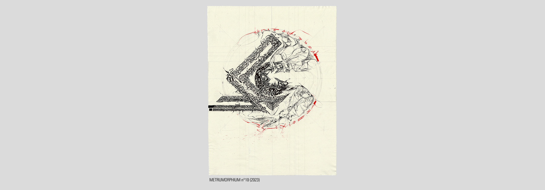
M E T R U M O R P H I U M is a series of work started in 2019, stopped in 2020 and continued in 2023 for this exhibition. This timing has a huge impact on the works. Hopefully you can experience the many slight differences between the older and newer works. As explained in Shodouroboros, I chose to write numberwords. Not Pi, because another number is tighter related to the eightfold figures (A motif quite frequent in Islamic art). I was interested in exploring the use of endless strapworks, but preferring asymmetry rather than perfect symmetry. These strapworks generate a lot of guided motion. They bring a still geometric shape into vivid pulsation. Metrumorphium plays with the terms „metrum“ and a mixture of "morphium" and "morphosis"... so something somewhat rhythmical aimed to fall into place via constant transformation. In the two newer pieces, the calligraphic styles are shifting and even transform fluently into mere textural fields and clusters.
M E T R U M O R P H I U M is een reeks van werken, begonnen in 2019, gestopt in 2020 en voortgezet in 2023 voor deze tentoonstelling. Dit timing heeft een enorme invloed op de werken gehad. Ik hoop dat u de talrijke kleine verschillen tussen de oudere en de nieuwere werken kunt ontdekken. Zoals in Shodourobos uitgelegd besloot ik telwoorden te schrijven. Niet Pi want een ander getal is strakker verbonden met de achtvoudige figuren (een motief dat heel frequent is in de Islamitische kunst). Ik was geïnteresseerd om het gebruik van eindeloos strapwerk te leren kennen en besloot daarbij liever tot asymmetrie dan tot perfecte symmetrie. Deze strapwerken genereren veel geleide beweging. Zij brengen een stille geometrische vorm tot levendige pulsatie. Metrumorphium speelt met de termen „metrum“ en een mengsel van „morphium“ en „morphosis“… zo streeft iets dat enigzins ritmisch is ernaar via een constante transformatie op zijn plaats te vallen. In de twee nieuwere stukken verschuiven de kalligrafische stijlen en veranderen zelfs vloeiend naar louter gestructureerde velden en clusters.

M N E M O K I N E S I A M n°1 is the first piece of the recently started series of work. The focus is simply put, to use script exclusively as a dynamic texture, while using geometry in a more obvious way. So far, I used script in two ways: As strapworks to guide the eye, and as eye-catchers to highlight a certain area. I asked myself if there could be at least a third completely different way to use script in geometric contexts: What, If I would not highlight anything, what If I don’t use script to guide the eye? This led me to experiment with ephemeral structures, such as those to be observed in dune-formations or swirling streams of water. A vibrating motion throughout the image can be observed, If you stand at the right distance to it. Approach it too closely, and this visual impression dissolves. Using script in this way, the geometric silhouette becomes very important. While the script dissolves into a mere web, it puts the silhouette into the role of the eye-catcher. Writing texturally automatically ends up being somewhat meditative: it demands for few words and mantra-like repetition. That’s why I called it Mnemokinesiam. It’s an allusion to the words „mnemosys“ (reminder) and „kinesis“ (movement). Like all the other titles, this one as well is nothing but a game of associations, that somehow looks like an old and strange language, giving away vague impressions of what this work is about.
I hope these words may help in making your visit here worth while. Yes... pictures do speak for themselves (and say more than a thousand words...) but in their strange language. They don’t explain what exactly went into making them. If you have any further questions or feedback, don’t hesitate writing me. And obviously: Feel free to share your personal experience here in the gastenboek.
If you are interested in a personal guided tour through this exhibition, you‘re welcome to join me on April 30th, at 10h30. I’d be happy to provide you with insights into the process behind these works and to answer your questions.
Enjoy your visit!
M N E M O K I N E S I A M n° 1 is het eerste stuk van een onlangs begonnen reeks of werken. De focus is, simpel gezegd, om schrift uitsluitend als een dynamische textuur te gebruiken en geometrie op een duidelijkere manier. Tot nu toe heb ik schrift op twee manieren gebruikt: als strapwerk om het oog te leiden, en als blikvanger om een bepaalde zone te benadrukken. Ik vroeg me af of er tenminste een derde volledig verschillende manier bestaat om schrift in geometrische contexten te gebruiken. Wat zou zijn, als ik niets wou benadrukken, wat, als ik schrift niet wil gebruiken om het oog te leiden? Dit bracht me ertoe te experimenteren met vluchtige structuren, zoals wij ze kunnen waarnemen bij duinvormingen of kolkende waterstromen. U kunt een trillende beweging door het hele beeld waarnemen als u op de juiste afstand staat.
Benader het te dicht en deze visuele indruk lost zich op. Als men schrift op deze manier gebruikt, wordt de geometrische silhouet heel belangrijk. Terwijl de schrift zich in een puur net oplost, zet zij het silhouet in de rol van een blikvanger. Texturaal schrijven houdt automatisch op iets meditatiefs te zijn. Het vraagt om weinig woorden en eist een mantra-achtige herhaling. Daarom heb ik het Mnemokinesiam genoemd. Het is een toespeling op de woorden „mnemosys“ (herinnering) en „kinesis“ (beweging). Zoals alle andere titels is ook deze niets dan een spel van associaties dat ergens op een oude en vreemde taal lijkt en een vage indruk geeft van waarover het bij dit werk gaat.
Ik hoop dat deze woorden mogen helpen om uw bezoek de moeite waard te maken. Ja, beelden spreken voor zichzelf (en zeggen meer dan duizend woorden…), maar in hun vreemde taal. Ze leggen niet uit wat precies gebeurde terwijl ze gemaakt werden. Als u verdere vragen heeft of een feedback wilt geven, aarzelt u dan niet om me te schrijven. En natuurlijk: Voel je vrij om uw persoonlijke ervaring hier in het gastenboek mee te delen.
Als u geïnteresseerd bent in een persoonlijke rondleiding door deze tentoonstelling, bent u hartelijk welkom op 30 april om 10,30 uur. Ik zou blij zijn u inzicht te geven in het creatieproces achter deze werken en uw vragen te beantwoorden.
Geniet van uw verblijf!
With kind regards // Met vriendelijke groeten,
Andreas Stoffels
////////////////////////////////////////////////////////////////////////////////////////////////////////////////////////////
last foto from left to right: Mieke Marissen (winner of the special-price / facebook), Gudrun Gratz-Fister (winner of the dante-price), Viv Mott (organiser & member of ARS-Scribendi), and me


Share the site
Share the page